User talk:LissanX
Welcome to Wikispooks!
We're glad you came. There's lots to do.
The Community portal is probably the best place to start for new users. To add a Wikispooks search facility to your browser, go here. If you've got a topic you're itching to write about, just dive in. If you're not sure where to start, you can introduce yourself by editing either this page or your user page. Robin (talk) 08:41, 13 September 2019 (UTC)
- Hey Robin! I’m glad to be here. Thanks for accepting my account creation request. I will try to contribute. LissanX (talk) 05:48, 24 September 2019 (UTC)
Site upgrades
Special:Version reports MediaWiki, 1.32.2 which although not the latest version is pretty up to date. I'm no expert on the site software or mobile responsiveness. Are you familiar with this stuff? Which upgrades are most important? Could a skin be useful to make the site more mobile friendly? We did have a request recently for using the visual editor. -- Robin (talk) 06:37, 24 September 2019 (UTC)
- Really, I didn’t realize. I’m not too experienced with Wikipedia software. Then is Wikipedia the way it is due to extensions? I mean, for example, the mobile viewing mode, the newest UI that let’s you edit more easily using mobile devices, language templates, as well as the page views section found on the history pages. Do you anything about how those aspects are added to a Wiki? If not, I could try and figure it out if you’re open to incorporating them here. LissanX (talk) 23:36, 24 September 2019 (UTC)
- I have some knowledge of how it works. Mediawiki allows for "extensions" which modify the functionality, and "skins" which modify its appearance. This site currently has some of the former (see Special:Version) and not many of the latter. This site should be fairly comparable in usability to Wikipedia, since it uses similar software. Are you talking specifically about editing using a mobile device? (If so, then installing the VisualEditor extension might fix this). -- Robin (talk) 01:43, 25 September 2019 (UTC)
- I don’t strictly mean using a mobile device, but that’s definitely one of the main improvements I think would really benefit Wikispooks, both in terms of readability and editability. If you’d like, maybe I can provide some side-by-side images of the differences I’m referring to. If so, just provide me with your email (or Wire Messenger, if you use it). I’m currently looking into how it can be done. — LissanX (talk) 02:43, 25 September 2019 (UTC)
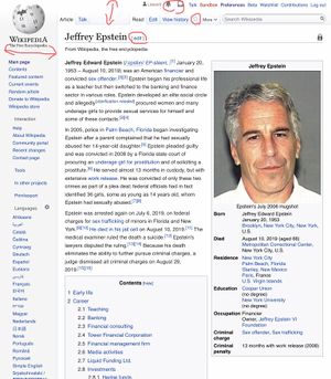
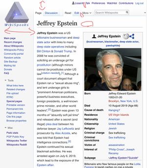
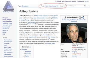
- Here are some differences which I’ve noted in crude red markings. The pictures were taken from screenshots I took while the page was displayed on my iPad. The WikiSpooks logo on the top right seems to be slightly too large, which negatively impacts the real estate used for tabs at the top of the page, especially on smaller screens or while in portrait orientation. It also pushes the article further down on the page. I think Wikipedia's proportions are based on Babaco Designs layout. There is no edit link next to the article title. WikiSpooks also doesn’t have alert or notification buttons at the top, though I’m not sure if this is necessarily a negative, I think they could help in editor engagement.
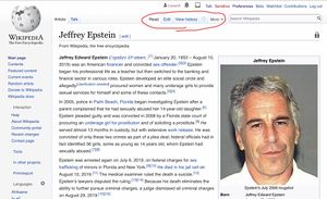
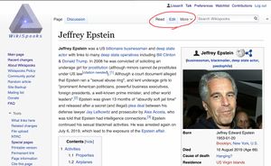
- Here is the same page in landscape orientation, with horizontal real estate expanded. You can see that the layout of options on the article's tabs are different.
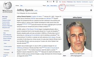
- Sometimes the tabs are displayed inconsistently. I think this is because of the large site logo forcing the two different tab organizations. Here is the same page in the same landscape orientation on the same device:
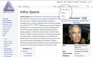
- And here is the same page in the same orientation with the dropdown menu expanded:
- Basically, the tab buttons at the top of the article page are less readily available on WikiSpooks compared to Wikipedia.
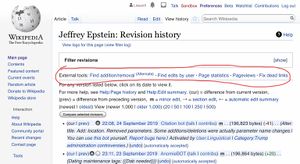
- Here are some images of the respective history pages. There is an edit button which opens the editor page for the main article from the history page. The Wikipedia history page includes Pageviews Analysis and X-Tools.
- In addition to these, there are the mobile view differences that we mentioned earlier. Wikipedia uses the MobileFrontend and MobileApp extensions, as well as the Minerva Neue skin.
- Viewing images is much more convenient and intuitive using the MultimediaViewer extension.
- I found this page of all of Wikipedia's extensions, skins, etc. Maybe there are other things that you think would benefit this wiki as well? — LissanX (talk) 22:56, 25 September 2019 (UTC)
Usability analysis
Good work on the usability analysis. I think I'll try reducing the size of the logo. Let's see whether that improves things... -- Robin (talk) 18:23, 27 September 2019 (UTC)
