Difference between revisions of "Wikispooks:History"
Jump to navigation
Jump to search
m (Robin moved page WikiSpooks:Logo to WikiSpooks:History without leaving a redirect: Not worth its own page) |
(Repurpose to import material from "About") |
||
| Line 1: | Line 1: | ||
| + | {{Work}} | ||
| + | ==Origins== | ||
| + | |||
| + | ==Influences== | ||
| + | |||
| + | ==Name== | ||
| + | |||
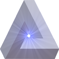
| + | ==Logo== | ||
[[File:Wikispooks logo.png|right]] | [[File:Wikispooks logo.png|right]] | ||
| − | + | The Wikispooks logo is often remarked upon. Administrator, [[User:Peter|Peter Presland]] explains how he came up with it: | |
I was casting about for a simple, unique, eye-catching, recognisable, memorable etc etc image - all the orthodox requirements of a logo in fact. It had to be a home-made job because the services of a professional was out of the question. | I was casting about for a simple, unique, eye-catching, recognisable, memorable etc etc image - all the orthodox requirements of a logo in fact. It had to be a home-made job because the services of a professional was out of the question. | ||
| Line 10: | Line 18: | ||
* The light shining though the impossible triangle symbolises the illumination that comes from recognising the true nature of all '''[[Project:Definitions|'Official Narratives']]'''. | * The light shining though the impossible triangle symbolises the illumination that comes from recognising the true nature of all '''[[Project:Definitions|'Official Narratives']]'''. | ||
| − | |||
| − | |||
| − | |||
[[Category:About WikiSpooks]] | [[Category:About WikiSpooks]] | ||
Revision as of 09:12, 5 December 2013
Contents
Origins
Influences
Name
Logo
The Wikispooks logo is often remarked upon. Administrator, Peter Presland explains how he came up with it:
I was casting about for a simple, unique, eye-catching, recognisable, memorable etc etc image - all the orthodox requirements of a logo in fact. It had to be a home-made job because the services of a professional was out of the question.
I perused hundreds of open-source images looking for something fitting the above criteria. I was well aware of the significance and widespread use of the triangular form in occult symbolism - especially 'Illuminati' related and that did indeed give me pause. However, in finally deciding on using it, my reasoning went like this:
- In spite of the reservations indicated above and because of its occult connections, a standard triangle is clearly consistent with representation of any 'Official Narrative'
- An impossible triangle (ie the Wikispooks logo triangle) is therefore representative of the misleading to impossible nature of any and all 'Official Narratives'
- The light shining though the impossible triangle symbolises the illumination that comes from recognising the true nature of all 'Official Narratives'.
